

State of New Mexico
Designers x5
Business Analysts x5
Developers x10
Client Skakeholders x4
UX Design Consultant
1.5 years
New Mexico state employees were juggling six different systems to manage client benefits, each with its own login, interface, and quirks. This led to high error rates, duplicated data, and a frustrating experience especially for customers going through a time of distress in their lives.
Redesign the experience into a unified, secure portal that could simplify workflows without compromising on accessibility or compliance with state/federal standards.


How might we simplify the benefits application process in New Mexico, so people can focus on getting help rather than navigating a complicated system?
Over four weeks, our team collaborated with the client team, including state employees and program administrators, to review their workflows and system experiences. I, then, synthesized user interview findings, identified pain points, and spearheaded an affinity mapping session to organize and prioritize insights.
These conversations revealed major pain points, such as:

I conducted market research to analyze other state applications and multi-layered platforms, focusing on how they organized and compartmentalized complex information. This helped identify best practices for structuring applications and dashboards with many moving parts, ensuring the solution was scalable.

I led a content audit to pinpoint redundant steps and complexities in the existing user flow, revealing key opportunities to streamline the experience.

This gave the team a strong foundation to ensure a consistent user flow structure as the design evolved
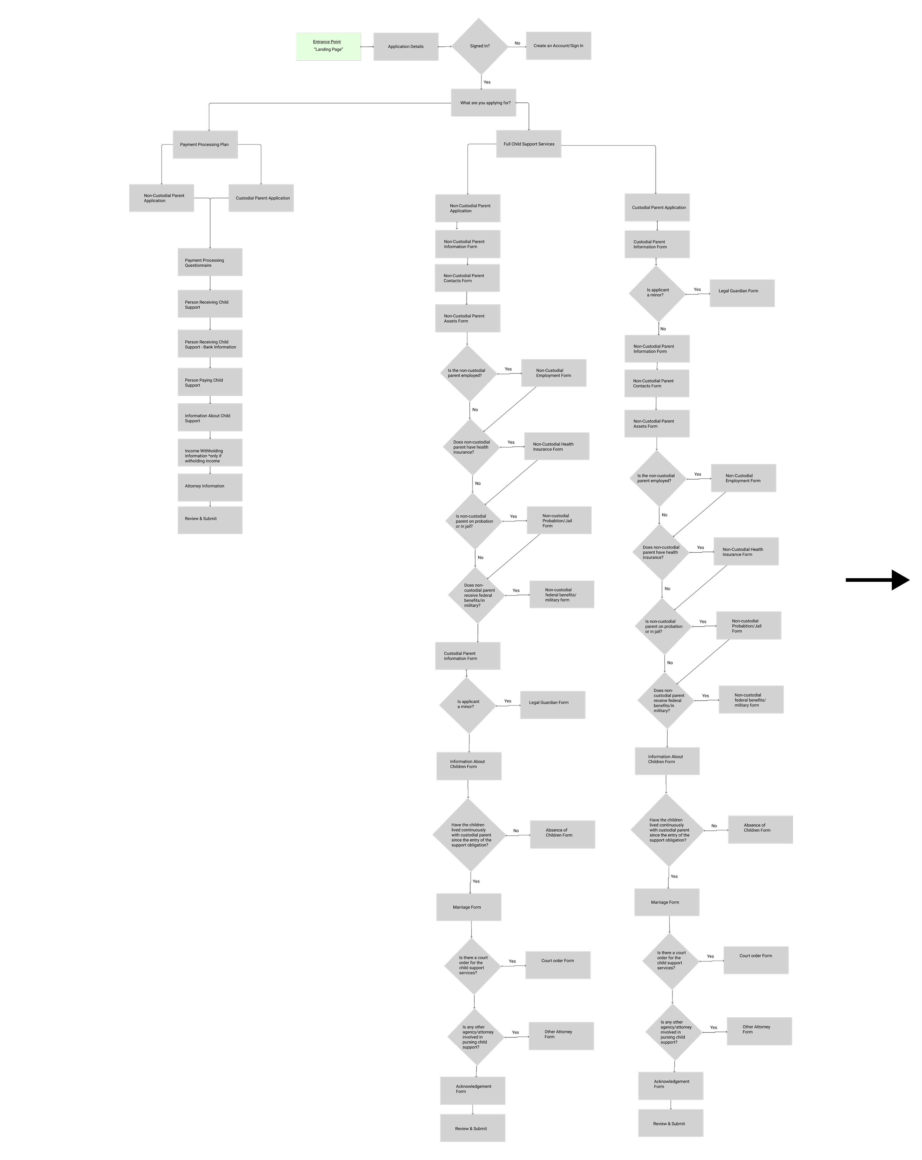
The application would be made up of 3 sections:

I conducted a task analysis by mapping out the user flow for a single benefit - child support. This helped identify branching points, dependencies, and opportunities to consolidate steps.
By starting with one benefit, I was able to define a scalable framework that allowed for the seamless integration of additional programs, streamlining content and reducing redundancy. It helped us establish expectations for the types of page templates needed and how they should interact


We applied the same user-centered approach to design the dashboard, prioritizing key information relevant to users without unnecessary distractions.
This allowed users to:
With a clear grasp of user needs and a solid information architecture, I moved into the design phase to turn those insights into a seamless, intuitive experience that aligned with the new branding while meeting both user and business goals.
At this stage, I started wireframing layout ideas for the application and dashboard, balancing user needs with researched design patterns to create an intuitive and effective structure. This helped me visualize repetitive user flows and identify reusable components as the application and dashboard evolved.


Given the large scale of the application and dashboard redesign, I expanded on our team’s building block and template strategy by enhancing the component library and creating detailed usage guidelines.
This allowed us to efficiently integrate relevant content as pages were developed while maintaining a consistent visual identity and branding. This modular approach ensured scalability, efficiency, and a cohesive user experience across the project.
We designed specific components for key parts of the application, such as form inputs, navigation menus, chapter pages, and individual modules. These components were drag-and-dropped into place as we constructed the full application.

We applied the same approach to the dashboard, designing dashboard-specific components that formed the foundation of its pages. These components were organized into a hierarchy of templates, ensuring consistency and scalability. By drag-and-dropping these modular elements, we created a flexible and intuitive experience tailored to user needs.

With the component and template strategy defined, I leveraged the new visual branding to build out key pages that laid the foundation for the refreshed portal experience.


The process was far from linear.
Over 6-7 months, we conducted approximately 72 user interviews with past and present state benefit applicants, while looping in the development team for prototype walkthroughs.
Several technical constraints and usability issues were uncovered early on, allowing us to address them early and quickly with development team.
One of our more prominent challenges was the limited backend customization due to client's Salesforce plane, which made data synching and tracking difficult during the application process. I collaborated closely with developers to design a dynamic, step-by-step tracking solution that adapted to user progress while staying within technical constraints.


Based on the client’s insights that most applicants had a 5th-grade tech understanding, I conducted 2 rounds of testing (24 sessions) to validate the effectiveness of new UI elements in the portal. These included bold notice indicators, tooltips, PSA messages, and friendly navigator language across the web experience.
Testing revealed a 85% success rate in task completion, confirming the effectiveness of these elements in delivering a clear and intuitive experience for all users.


To streamline development, I managed the building blocks/design system library in Figma, which documented standardized templates for the application and dashboard. The library detailed each component’s usage patterns, margins, and sizes, allowing developers to build once and reuse across the platform. This approach ensured consistency and efficiency, as any updates to a component automatically applied everywhere it was used.


"This new portal is so much easier to use, and thankfully it's all in one place! I used to dread checking my benefits..."
- New Mexico resident

Designing for such a diverse audience required balancing client expectations, technical constraints, and tight deadlines, all while staying focused on creating an inclusive user experience. By prioritizing critical pain points and collaborating closely with stakeholders, we delivered effective solutions that worked within constraints without compromising usability.
The impact was profound:
This project reinforced that great design isn’t just about meeting requirements; it’s about solving real problems and creating a lasting, meaningful impact on the people who need it most.

